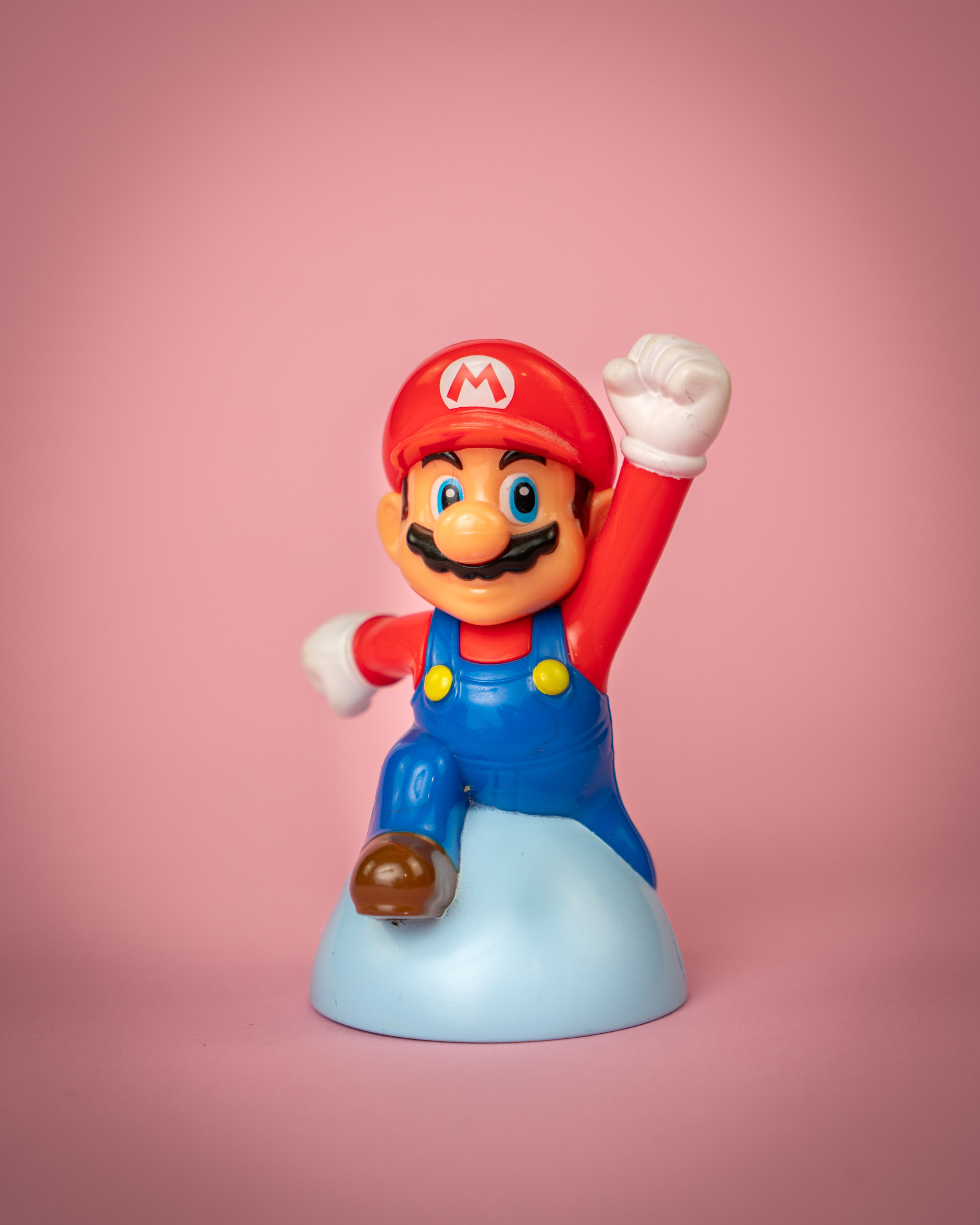
Color and Form Part 1
Marketing success depends on having a deep psychological understanding of customer needs. So before you can share your mission statement, service, and, sales you have to get their attention.
To get someone to stop scrolling and stop on your post, add color and pizzazz! Keep it consistent with your branding so people start recognizing your marketing materials.
Lots of money has been spent analyzing people's penchants and persuasions as they relate to color, so use that to your entrepreneurial advantage!
Red is associated with danger, excitement, and energy. It’s also known for being the color of love and passion.
Pink is feminine, it’s sentimental and romantic. Different shades, like hot pink, can be youthful and bold.
Orange, like it’s namesake, is fresh and full of vitality. It’s also creative, adventurous, and associated with being cost-effective.
Yellow is optimistic. It’s a color associated with being playful and happy.
Green is natural, often used to demonstrate sustainability and freshness. But it can also align with prestige and wealth. (One of INGroup's personal favorites).
Blue is trustworthy and reliable. It’s calming and peace.
Purple is royalty and majesty. It can be spiritual and mysterious.
Brown is down-to-earth and honest, often used for organic wholesome products.
White is pure. It conveys simplicity and innocence, often with a minimalistic feel.
Black is both sophisticated and elegant. It can be formal and luxurious, but also serious and sobering.
Spent some serious down time thinking about what your brand coloring is telling your audience and whether or not is helping or hurting your business. Confused? Colorblind? or Hue Choosing Challenged? We're just a click away!


